All Posts By

Jami Dodson

Mount Whitney

We Lookin’ Good

By | Design | No Comments

Last week I attended an AIGA DC event, listening to magazine editor Scott Kirkwood and in-house designer Annie Riker speak candidly about their work elevating the design of the National Park Conservation Association’s magazine. What began mostly as a glorified newsletter has become an award-winning publication, blazing a trail that helped elevate the entire fleet of print design coming out of their in-house creative department.

Granted, the transition took time (eight years), and the vision of an employee who made it his passion to make the work better. It also took multiple small steps and taking risks on investing in the creative department, and, ultimately, its output. Kirkwood was pivotal in educating his constituents within the organization—regional offices, fundraisers and supervisors—and once these key players started seeing the results and hearing the positive feedback of the new and improved look, they became increasingly aware of the power of good design. Readers even commented on the revamp, something that had never happened before.

If people realize that design is a stimulant to increasing readership, raising awareness and opening checkbooks (smart businesses have even started buying design firms), why then, do so many nonprofits and organizations churn out lackluster communication pieces? If it’s a question of money, sure, I get it. And that certainly is a part of it. If I had to guess, for many organizations, it’s not because the money isn’t available within the organization—it’s because the cash isn’t allotted for things like a copywriting budget or for hiring better designers. Marketing and communications are the first to go in a pinch, with essential funds directed to solely carrying out the mission.

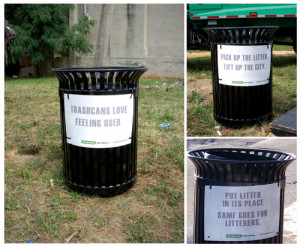
Of course there’s the “we don’t want to look too good” excuse. That one kills me. I’m sorry, but I’ve never heard of someone no longer being interested in saving the whales because the direct mail piece they received has become more engaging, easier to read and incorporates storytelling. Can something be too professionally designed? What makes a memorable statement isn’t an expected solution. That’s not to say it has to be expensive or flashy. It’s sad when there’s such a disparity between an organization’s mission and its public-facing visual communications.

Twenty-five years ago, buying things like media and direct mail campaigns were expensive marketing tactics. With so many new (free) ways to reach potential donors now, it’s a disservice to not take advantage of them. Nonprofits need to have a strategy to get them to the next level. Think about the competition:

There are more than 1.5 million nonprofits in the United States. That total has doubled in less than two decades. Meanwhile a $500 billion bonanza of impact investing is helping pump out a steady flow of social enterprises. As if the space wasn’t crowded enough, many big corporations are finding a higher calling and becoming purpose-driven enterprises themselves, some for real, others for show.—Heath Shackleford, FastCoExist

The seminar course in the University of Baltimore’s MA in Publication Design program is structured around student teams launching a nonprofit and producing the creative to make it successful. This year I was excited to be a judge for the remaining five teams’ presentations. They were all impactful; the research and thinking that went into the concept and the writing and design of numerous supporting components was impressive to say the least. Business plans and budget planning were not part of the process, therefore I was surprised that the design, for the most part, was safe and expected. Maybe the students were being realistic as they’re all too aware of tightening budgets and scarcity of resources on the eve of their graduation. Had the assignment been to launch a new profit-bearing business, I wonder if the work would have reflected bold messaging and quirky executions.

While Kirkwood’s talk was poignant (and inspiring) for the creative community, he’d probably have some success sharing his overhaul stories with the non-designers (aka, the decision makers) running the nonprofits. Small changes can add up to something truly representative of the organization’s mission, but it takes an integrated team to take the summit.

IMAGE CREDIT. Geographer on Wikimedia .

Anytown, Anywhere

By | Design | 5 Comments

It’s been over ten years since the ubiquitous Believe banners papered Baltimore as part of then Mayor O’Malley’s campaign to curb drug use and bolster neighborhoods. While remnants of it and ghosts of city campaigns past (“The Greatest City in America,” “The City that Reads,” “Get In On It”) can still be found in office windows and fading on wooden benches, let’s consider what a new brand for Baltimore would look like. Is it even possible to harness the pride and history of a place so riddled with disparities?

Branding a place, rather than a company or thing, is en vogue. Even 35 years after its introduction, Milton Glaser’s I Love New York campaign generates more than $30 million a year. Not to mention the link many people believe it had in curbing New York’s crime epidemic of the early 1980s. In light of national tragedies and disconnected citizens, there is a lot of talk these days about building communities and being a better neighbor.

Going beyond giving a city a campaign with a logo and color scheme, Robbie de Villiers and Jeremy Dooley created a typeface for the city of Chattanooga, TN to give visitors a sense of Chattanooga’s entrepreneurial potential and creative spirit. Chaface the typeface appears on city signage and documents, and is available for download after watching a short video about the designer’s vision of its usage.

From their winning Kickstarter page: “Chattanooga boasts a burgeoning design community, a music scene that’s playing some fierce catch-up, and a culture of entrepreneurship that’s gaining national attention. With around 500,000 people, Chattanooga is at that right developmental stage to adopt and embrace a strong, city-wide visual identity.”

Couldn’t the same (exact) thing be said about Baltimore? A typeface solution is an innovative approach which could easily be overlooked by non-designers. There are plenty of artistic types living in Bmore, but I don’t see a city movement rallying behind serifs and x-heights.

AIGA Toledo partnered with the Arts Commission of Greater Toledo to develop a city campaign during a national glass conference. Regional artists designed 100 three-foot “dots” with QR codes and placed them throughout the city. An app was developed for users to collect the dots and receive information about each particular location. Incentives were given to those who collected at least 25 dots.

My favorite aspect was the amazing responses we got from Toledoans who fell in love with their city all over again.

While the “You Are Here” concept isn’t incredibly original, the campaign proved itself with some impressive metrics:

  • 139 App downloads the first day

  • 832 total App downloads

  • 3,791 unique site visitors

  • 8,597 dot detail page views from mobile devices

When the Baltimore Area Convention & Visitors Association rebranded Baltimore to tourists in 2008, it hired branding mogul Landor to create the look. Visit Baltimore (as they are now known) performed a huge disservice to the local design and advertising community, who live and work and breathe here, by outsourcing the task (read: paying a lot of money) to a global firm with offices beyond our state’s borders. I’ve discovered that sometimes people need to spend a lot of money on something to feel like they are getting something of value.

Because Baltimore has very unique and contrasting neighborhoods, perhaps it would be more effective and create more social change if we develop micro-brands of our communities instead. Selling Baltimore to outsiders looks different than selling Baltimore to insiders. If we asked our neighborhoods to consider the nuances of their home within the city and ask what that looks like, we’d get to know our neighbors and encourage a sense of pride bolder than with branding the city as a whole.

What’s your tagline for Baltimore, or for your neighborhood? Let Baltimoreans brand Baltimore. Tweet #brandbmore, @ChangEngine to tell us what Baltimore’s slogan should be!

IMAGE CREDIT. pauls95blazer on Flickr .

Links in the Food Chain

By | Design | No Comments

If my love of design stemmed from the cognitive side of my body, my love of all things food grew from my heart (and belly). Cooking, eating and sharing a meal with others are daily actions that are an extension of who I am, and will always nourish me during the darkest of hours. For me, relishing in the delight of food also serves as a form of gratitude; that I can afford to buy these tender stalks of asparagus or I have the Sunday afternoon to devote to baking a pie. I do my best to be a steward of both fridge and pantry, using up the limpest broccoli first and finding thrifty new meals to concoct out of yesterday’s leftovers. Although I am conscious of throwing away food, there are times when I just don’t feel like tuna salad for the fourth day in a row (bleh), or my compost worms are munching on beet greens (again).

Food waste in industrialized countries is a problem that can be amended. Americans wasted 33.79 million tons of food in 2010, a 16 percent increase from a decade ago. The average American wastes 209 to 254 pounds of edible food each year. Many contenders are at fault—retailers, restaurants, farms and individual’s own assumptions about imperfect or expired food.

The food waste problem has garnered attention, however, and there have been recent efforts to tackle the issue, from various angles and sources. The diversity and uniqueness of these efforts are what strike me as effective—an example of how multi-disciplinary approaches work together towards a common goal.

Getting the unused food to the public.

Food Cowboy, an app in beta, connects imperfect or blemished produce with people in need. Roger Gordon saw the opportunity when his brother in the trucking industry used to end up with trailer loads of rejected produce. He’d make calls and get the food distributed to those who could take it, saving many pounds of greens. Gordon now works with two large trucking firms and about 20 charities in the I-95 corridor, rescuing food and helping food companies dispose of it in a sustainable way such as composting.

Since the Maryland Food Bank started their Farm to Food Bank Network in 2010, 51 farms have begun donating produce to relieve hunger across the state. Through a partnership with the Maryland Department of Corrections, produce normally left behind after harvest is gleaned from the fields. Last year, 279,000 pounds of green beans, sweet potatoes, and other produce that might have gone to waste were harvested. Produce is distributed in food deserts by way of mobile pantries or cooked into meals for youth supper programs.

Using unused food in unexpected ways.

Maximus Thaler, a Tufts student, is hoping to open a café and grocery store this summer out of his apartment in Somerville, MA. Unlike the underground dinner clubs popular among hipster foodies, the café will serve its food free of charge with food salvaged from area dumpsters.

Taking your scraps, literally.

Compost Cab couldn’t make composting easier in Baltimore. They drop off a bin, you fill it with your organic scraps, and they come pick it up for you and deliver it to urban farms.

Rewarding those who dispose of food in sustainable ways and educating the public.

The Noun Project is a collaborative effort creating a global visual language for increased communication. During Public Interest Design week at the University of Minnesota, Iconathon attendees convened to create a badge-like system for placement on restaurant doors and windows, rewarding businesses who recycle or compost. (As of this posting, I haven’t found a recap of this event.)

The list could go on, but you get the point. It was just a few short years ago that specialists dominated business decision-making—hiring a consultant was the way to go. Now enterprises and non-profits are both catching on to the trend of multi-disciplinary problem solving, especially with the proliferation of social design graduate programs that attract design thinkers from all traditional job roles — a trend I look forward to exploring in a future post!

IMAGE CREDIT. Wikimedia Commons. Are we prejudiced against imperfect fruit?

When Design Doesn’t Change

By | Design | 2 Comments

In this column I usually pump up the merits of good design, particularly graphic design, and how it can implement social change. While the fact that designers have the power to do good is indeed a truism, recently I’ve been considering times when implementing graphic design as an agent of change just doesn’t cut it. In other words, a design FAIL of sorts. Not in the sense that the FAIL means design isn’t part of the solution, but rather how design only makes up part of the bigger picture.

I am constantly appalled and baffled by the amount of trash I see on the city streets and sidewalks as I drive or walk by bus stops. I once (okay, twice) got into an altercation by handing someone’s trash back to them after witnessing them throw it out the car window. While it’s not a social problem among the magnitude of homelessness or human trafficking, it’s a disgrace to the community and our environment, and a reflection of just how gross humans can be. I’ve thought about this issue in depth and even discussed it with friends numerous times — how do we keep everyday citizens from throwing paper trash on the ground?

In the 70s Mayor William Donald Schaefer launched a campaign to make trash cans look like basketball hoops, encouraging passerby to “Jam one” in. (He also sold potholes as Valentine’s Day gifts.) A few years ago local ad agency Planit took a stand against litter by implementing an anti-litter campaign, some elements of which are still evident on trashcans at bus stops and on garbage trucks. Were these successful and how do we know that they were (or weren’t)?

trashcan_collage

Don’t Mess With Texas celebrated its 25th anniversary in 2011 as the most successful anti-littering campaign ever. Started in 1985 by the Texas Highway Commission, the campaign targeted “Generation L”, 16-24 year olds who drive, eat fast food and smoke. It featured country singers in TV ads and billboards. Discovering that children who see their parents litter are more likely to litter themselves, the campaign began to reach out to elementary schools and push an educational approach. Their research showed in 2001 roadside litter had dropped 52 percent since 1995, and in 2005 it had dropped 33 percent since 2001. How this research was conducted I’m not sure, but their approach seems to be working.

While these anti-litter campaigns are memorable, real social design should mean finding ways to engage public participation and gauge effectiveness in these pursuits. The behavior has to be changed, but how? Designing a catchy ad is only one approach. Part of it could also be teaching through the generations. Part of it is instilling an awareness beyond the self. Maybe maintain nice bus stops with attractive trash bins to create a sense of pride. Try designing a system to monitor congested bus stops during high volume usage to create awareness.

Sometimes to design for social good means to question the methodologies of why you’re designing in the first place. Get out, ask questions, talk to neighbors, form a coalition, listen. The solution is not (and should not) always manifest as a clever headline with a punchy palette. Sometimes picking up a shovel, attending a neighborhood association meeting or mentoring a teen does more than a Clone Stamp tool ever could.


IMAGE CREDIT: Flickr

On the Record: eHealthRecord

By | Design | No Comments

Do you remember David, the boy in the bubble? Born with severe combined immunodeficiency (SCID), a primary immuneodeficiency disorder, or PIDD, that causes the immune system not to work, David — portrayed by John Travolta in a 1976 movie — might be the only reference most people have for this type of disease. But for Colin Seal and many other individuals living with them, the ability for the body to heal itself from certain types of infections is severely compromised.

Colin is leading a very productive life helping others who have this type of deficiency. A patient with PIDD himself, Colin became involved with the Immune Deficiency Foundation in Towson as a volunteer before he began working there. The Immune Deficiency Foundation was started in 1980 by Marcia Boyle, the mother of a son with a primary immunodeficiency disease, to help improve the quality of life for patients and their families. I recently spoke with Colin, a Program Manager at IDF, about a new project designed to help patients manage their health record information, and how it both supports IDF’s research about the disease and serves as a clear example of how tech and design can enhance people’s health.

Most PIDDs are genetic disorders. In the United States, more than 250,000 people are diagnosed with primary immune deficiency diseases. Thousands more go undetected. These diseases are chronic illnesses caused by hereditary or genetic defects in the immune system in which part of the body’s immune system is missing or does not function properly. Because of this increased vulnerability, patients are at great risk for prolonged infections and suffer from recurrent health issues.

With early diagnosis, medical advances and consistent monitoring of health, individuals are able to live full and “normal” lives. People with PIDD usually require regular immunoglobulin therapy infusions, many kinds of medications, close monitoring of reactions to medications and diligent maintaining of medical records. By conducting surveys about patient experience, the IDF team discovered a lot of patients were not keeping personal records of pertinent medical information. Seeing the opportunity to make this easier, IDF began an effort to make an electronic notebook. This eventually evolved into the IDF eHealthRecord, an online application that assists in documenting health records and data specifically for the primary immunodeficiency community.

EhealthRecordLOGO2

The eHealthRecord helps patients to track diagnosis, infections and symptoms; scan and save important documents; and log doctor’s visits and medications, among other features. I was impressed with Colin’s enthusiasm for the project, and especially the attention to customer service that IDF provides to their eHealthRecord users. Anyone can get assistance via phone or email and get a personal response, along with a screen-share demonstration. CSL Behring, the sponsor of the IDF eHealth Record, even provided funding for a small in-house green screen, where Colin himself stars in “4 minutes or less” YouTube tutorials. Colin regularly attends meetings where he has the opportunity to talk to patients about how to use the program. Not to mention the private Facebook community where patients can reach out to others, ask questions and share stories.

http://youtu.be/67e50dOkyzI

From what I saw pulled up on Colin’s iPad, the module could use a little design love. Turns out they are already redesigning the user interface and overall user experience now and ironing out little quirks. Colin’s team sent out surveys to current users, and armed with information on exactly how the product is being used, can refine the interface to be approachable and intuitive for its users.

Where to go from here? Mobile, for a start. The IDF eHealthRecord is only web-based currently, with a mobile version in the pipeline. With the big push for “mobile first” in the web design community, this app may be an example of when developing the desktop version first made sense. Colin also emphasized how important the data pulled from this system (which is HIPAA-compliant and completely anonymous) will be to mapping the diseases and could possibly contribute to better integration with doctor’s offices.

A development such as the IDF eHealthRecord demonstrates the type of design thinking processes that should be at the core when designing for social change. Colin isn’t a designer, but he and the IDF team knew the right questions to ask and looked at the real needs of the primary  immune deficiency community in order to develop a solution. And they chose to partner with developers (an outside firm) who didn’t just say yes to the project, but helped set the scope and made recommendations, applying their expertise. The nonprofit sector seldom affords the ability for mere experimentation, and empathetic designers who see the bigger picture produce better results.

Special thanks to Colin Seal.

IMAGE: By David Gallagher

Color Shift

By | Design | No Comments

In 1978 San Francisco artist Gilbert Baker designed the LGBT pride flag, inspired by either Judy Garland or Allen Ginsberg, or both. Rainbows were never looked at the same way again. And since the nineties, the bubble gum pink ribbon has been slapped on the back of SUVs everywhere, rallying for breast cancer awareness. Colors have long been associated with social issues—green for environment, red for AIDS, gold for military support—but how does color influence our choices to create change?

This was one of the questions graphic design students were pondering at the outset of a collaboration between Pantone and the San Francisco Academy of Art University. Pantone, the world-renown authority on color, initiated the Color in Action project to seek ways for color to effect social change. (Pantone celebrates its 50th anniversary this year.)

Eight teams were assembled around a central focus on issues like environment, literacy and education. The teams began by researching how color can change behavior and explored how color could brand a cause. One team developed a shape/color matching system for the visually impaired.

reveal-education-card-set

Another team focused on climate change by indicating just how high sea levels would rise on buildings and in urban areas.

drowntown-2020-ribbons drowntown-2020-steps

The winning team, Team Bullying, was announced in May and awarded a $10,000 scholarship. Their creative efforts are detailed on the website ColorCoaltion. Their goal is to reduce aggression and bullying, build community, and encourage students to embrace diversity by enhancing school environments with color. Other teams’ initiatives can be further reviewed here.

300

“Color in Action is undoubtedly a remarkable project that challenges students to look not only at today’s pressing social issues but to also inspire change through creativity and color,” says Pantone director of Corporate Marketing, Giovanni Marra

The Color in Action collaboration will continue this year, building on the anti-bullying team’s vision. Students will work with a local school to prototype a teaching guide and begin painting from their palette in the real world. I don’t have more in-depth information about the exact questions Pantone was seeking to answer from the Color in Action challenge, other than the aforementioned, but the idea of color choices and how they impact change is worthwhile to consider.

Any designer with an art schooling background has read books on color theory and some have studied it in great detail. From an interior standpoint, psych studies have demonstrated that certain colors certainly do impact moods and behaviors. But do colors used in a brand or ad campaign affect outcomes surrounding social change? Or is it simply our (developed) associations and the longevity of the brand? Tiffany blue boxes would seem out of place if one day they debuted in forest green. There should be ways to measure efficacy established to test these color theories. (It seems to work for drunk tank pink.)

No doubt at least subconsciously, color affects how we feel about a particular product or brand, and ultimately the choices we make. It helps identify a specific social issue and makes concerted efforts become more memorable. I’ll be promoting the power of color in September, when I work with the Maryland Food Bank and Feeding America to promote Hunger Action Month. Watch out Ravens purple fans—we’ll see how orange we can get.

IMAGE: Courtesy of Imprint.

It Takes Guts (and a Village)

By | Design | No Comments

One of the challenges for designers like myself who want to explore more social change work is how to physically go about it tackling it. A web app for a public health non-profit or a tangible guide for street vendors is the outcome to solving a need. But what happens between the idea and the execution? How do we mind the gap? As I seek ways to expand my role as a designer from solely creating graphic design for causes to seeking out actual problems and collaborating with others to discover the best solutions, any insight is a boon.

Last week I attended a lecture by Andréa Pellegrino, a principal in the working world of design for social change. Her LinkedIn profile summary begins: “innovative senior executive working at the intersection of strategy, research, communications and business development for forward-thinking organizations dedicated to driving positive social change and building brand equity.” Her latest project , together+, is intent on fighting xenophobia in South Africa, one community at a time. Using this undertaking as a touchpoint, the talk centered around the critical processes of actualizing solutions to social challenges with an entrepreneurial spirit.

Pellegrino’s together+ initiative spurred four different design solutions—a community mural project; Blooming Together, a curriculum-based children’s book proposed to be sold into the local school system; an informative poster and pamphlet on healthcare rights, and; a welcome guide to immigrants.

Solutions come from community need. Partner with the community to identify the problem. Instead of applying assumptions about what you think is the problem, listen to the voices from within the community. Learn how to communicate with the community you are involved with. Also by getting local and starting small, it is easier to maintain and measure results. If a solution works on a small scale, it can be expanded to a larger audience.

Approach the project with a business model perspective. Pellegrino applied real business strategy to resolve the xenophobia issue. Develop a plan and a timeline, undertake research, estimate hours and resources needed, develop a budget. This not only helps clarify things for grants and fundraising purposes, but also provides actual mileposts for progress.

Multi-disciplinary teams create the best solutions. The whole notion of design thinking relies on its cross-genre approach to problem solving. Andréa reached out to her network through all of life’s touchpoints—alumni network, community involvement, geographical contacts, her collaborations with corporate clients, as well as her partnerships from past employment. Reach out to your network and build collaborations.

“Getting corporations involved is the future of this kind of work.”—Andréa Pellegrino

Assess impact. The bottom line. While social change will have different metrics than a promotional direct mail campaign, there are tangible ways to measure effectiveness. Allow funding for this important step.

To these stepping stones for implementation I would like to add one I consider to be paramount: finding passion. Pellegrino is right when she says that it takes guts to do this type of work. It’s not easy. Without passion, none of this work would come to fruition. Her perspective on these considerations when implementing social change gave me confidence that there are concrete ways to take action on an idea. Many designers tend to focus on the visual solution when sharing in this vein. Maybe it’s easier to hide behind the smoke and mirrors of a Mac than being out on the front line. Although that’s where some of us should stake our claim.

IMAGE CREDIT. Courtesy of Northfield.org.

More Than Just Good Looks

By | Design | No Comments

Designers spend a lot of time thinking about how things look. Move that headline down, try a script font, add seven percent more magenta. We’re picky about details, and we like it that way. It’s ironic then, that when it comes to showing how good design can change the world, and how to measure that impact, we often fail.

Last November, as part of the Design Thinkers conference in Toronto, the Association of Registered Graphic Designers of Ontario (RGD Ontario) held the first international Social Good Design Awards. A panel of judges perused 200 entries from 11 countries to select 35 winners, which were featured in a gallery exhibit at the Gladstone Hotel and in a catalogue distributed to RGD professionals.

awards1

The competition is a new addition to an increasingly popular field of social design recognition and awards listings in recent years. But the trend begs a larger discussion of how we should measure “good” design, specifically design as an agent of change, and how design is presented to the public eye.

Design award competitions have certainly had their backlash, interestingly from members of the design community itself. As Maria Popova rightfully stated in her op-ed piece a couple years ago on Design Observer, design needs less ego and better metrics and measuring devices.

Can we create a system of recognition and a merit metric that isn’t bestowed top-down by a handful of omniscient industry veterans but, rather, extracted bottom-up from design’s impact on the cultural space, social function and community it lives in?

This isn’t a new argument. Many awards shows are judged on handsome looks, smooth execution and style. Stripped away are the budgets, the timeframe, the context in which the project was executed, and all the other nuances that capture good design, which are even more important when designing for good.

Design awards are a currency of the ego economy, not of the culture of collaboration.

Beyond the inner circle of design-speak, most people don’t understand the depth of what designers actually do, other than making things look nice. And “nice” is especially relative these days, when mediocrity is acceptable to most. Beyond the visual aesthetic, the impact of design is difficult to measure and few actually have the resources to make a quantitative analysis. Without finite percentages and hard numbers, most people have difficulty measuring design’s success.

By asking ourselves questions during the design thinking process, we can find ways to measure success and better explain what we do to others, as well as provide a foundation for elevating the impact of design on humanity. Is the idea carefully considered with the user in mind? Does it provoke thought, raise awareness or call to action? Does it make a life easier? It makes more sense to demonstrate to others how a design project changed behavior or provided a solution, rather than just how slick or impressive it looks. Moving in that direction, Fast Company‘s Innovation by Design Awards tries to give some substantive insight to the problems winning projects aim to solve – from an elegantly simple wheelchair that smooths the rides over rutted paths in poverty-stricken countries to an iPhone game for children with cancer that allows doctors to more accurately track their pain level.

Designers need pragmatic real-world solutions to be inspired as much as they need I-wish-I-did-that pieces of work. Judging it on visual beauty alone leaves out why many of us chose this type of work as our life passion. It can be fine art on a wall, but design has the power to be so much more and it’s up to us to designate its value.

Images courtesy of RGD Ontario.

Dwelling at A Red Light

By | Design, Homelessness | No Comments

Every weekday on my commute, I sit at a certain traffic light, and I can’t ignore the piles of blankets and boxes in my peripheral vision – someone’s makeshift home. And while January forecasts in Baltimore have been mild thus far, it’s heartbreaking to think that no matter how many blankets are piled up or boxes are assembled together, that it is no substitute for a roof and four walls. Easing my foot off the brake, I mentally express my gratitude, and continue driving.

Most of us lucky enough to have a place we call home will never have to experience or understand the fine, delicate line that separates us from them. Often the assumption is that those unfortunate souls did something to cause their misfortune – they’re drug addicts or they can’t commit to a job. What is often not realized is the events that can occur, over which we have little to no control, that can change a life.

Recognizing this disconnect, Durham, N.C.-based McKinney took an unconventional approach to helping Urban Ministries of Durham educate the public on issues of poverty and homelessness. UMD helps meet emergency needs for food, clothing, and shelter; and helps those who are homeless secure a home and the resources to stay there. Taking a cue from popular online games such as Farmville and Mafia Wars, McKinney team members created Spent, an interactive game that incorporates social media to raise awareness about these issues.

Developed entirely gratis in 2011, Spent forces the player to make all-too-real decisions that can lead to a downward spiral of poverty. The site has been featured on CNN, NPR, ABC News, Fox News, Mashable and The Huffington Post. AIGA – a professional design association – published a full case study, including results, here.

Try playing. You’ll soon see that $1,000 a month doesn’t go very far. When faced with tough choices, like between feeding your family or fixing your car that provides transportation to work, that thin line between us and them becomes a mere seam.

In writing this column, I’ve been made aware of how designing effectively for social change today means much more than a propaganda poster. There will always be those nuts and bolts two-dimensional necessities – the annual reports, websites, the letterhead. Let’s create more engaging experiences, where real connections may be made. Spent is effective because of its empathetic approach, and because it’s not the expected homelessness ad. By mirroring the corporate world’s interactive campaigns, partnerships, and promotional tie-ins, social change and nonprofit organizations can become, well, more social. And the more people aware, the greater the chance that someone will take action.

Resolutions of Change

By | Design | No Comments

When I was laid off less than two years after beginning what I thought would be a glamorous career in advertising on Michigan Ave., I was shocked. I cycled through every emotion — confusion, fear, regret, anger, insecurity. It was a roller coaster I hadn’t prepared for.

I’d read books by Ogilvy, knew the cool shops like Wieden + Kennedy, GSD&M and Crispin Porter + Bogusky. I admired Arnold’s Volkswagen campaigns and kept up with new pitches in AdAge. I had spent my college years like most Gen X’ers — with the belief that my hard work and dedication would pay off with an entry-level gig at a big agency, working on big-name accounts and cluttering my desk with creative awards.

It might still work out that way for some people, but it didn’t for me. And I’m glad. The economy tanked, and it sucked for many of us, and then slowly people realized they had to adapt or die. The world of advertising and design has changed drastically and will continue to change for years to come.

I recently read George Prest’s Advertising Is Dying. Long Live Design blog post, nodding my head in agreement. The executive creative director of R/GA London challenges the traditional role of advertising, stating design is at the core of the new marketing. Information design, graphic design, experience design and product design, all shape and shift the brands advertisers once shrouded in clever wordsmithing and special effects. The true essence of a product, or a service, or a person, now lays out in the open, to be poked and prodded by anyone. And the world needs those design thinkers more than ever.

Obviously technology and the social aspect of marketing are huge catalysts in the nouveau design and advertising ecosystem. I believe the most profound change (even reflecting on 2012 alone) is in the growing emphasis now placed on social enterprise, and the wonderful things that are being developed out of cross-disciplinary collaborations. Small partnerships to mega corporations are embracing the value of design for social change. Advertising was once a cool kids club that seemed secretive and esoteric to outsiders. Design has been present all along, in multiple disciplines, waiting patiently for its moment to shine. And slowly, the big thinkers and creatives are shifting their awareness to inclusion. Everyone deserves great design.

Thank God some humanity is seeping back into our industry. It’s long overdue. Ironic, though, that it took technology, machines that we invented, to make it happen. —George Prest

I’m looking forward to seeing the application of design continue to evolve. And I resolve to be ready to adapt and be part of this exciting movement. How can design change something for the better this year? To use TBWA/Chiat Day’s groundbreaking Apple ad campaign tagline, “Think Different.”

Image from Wikipedia.

Image from Wikipedia.


PHOTO CREDIT. Feature image by mortmer via flickr.